Using open ended questions like the Text Field and Text Area are a great way for you to collect detailed responses. Closed question types will only tell you that X number of people selected answer A, whereas open question types will allow participants to write out an answer in their own words.
You will find the Word Cloud chart is now available in your report. This chart has been designed to pick out the most common words from your responses and display them in a word cloud diagram, where the more common the word the larger the text.
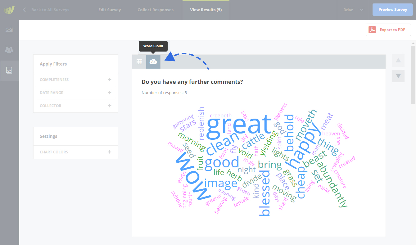
Since the responses will contain words written directly from the participant, some answers will contain completely different adjectives, verbs and nouns. The Word Cloud will filter out punctuation and unnecessary words (like a, it, the, etc.) to only display useful words.
We are always looking for new fun ways to display your response data and hope you like this addition to the report charts. You can change chart types in your report starting from the Professional Plan.
As always, we welcome any feedback you may have:
